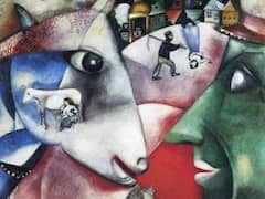
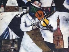
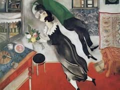
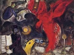
The Poet, 1912 - by Marc Chagall
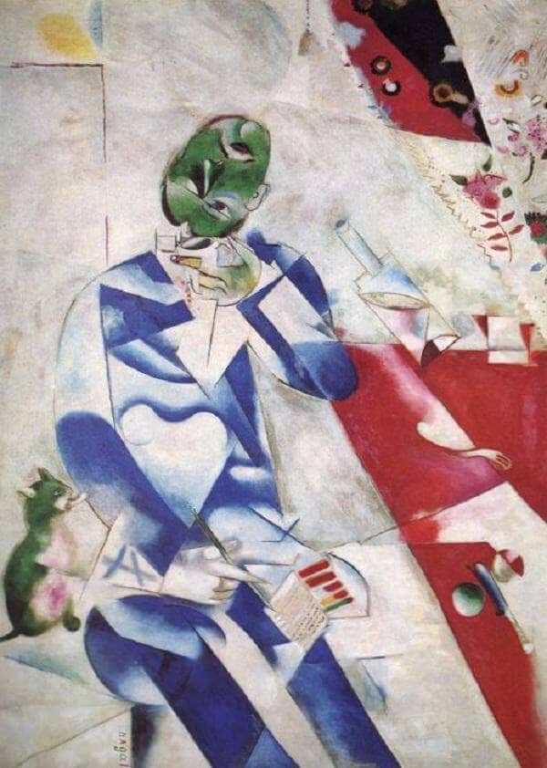
What Chagall was aiming at in meaning and form in the little portrait study of Mazin is made surprisingly evident by The Poet, a large composition which he felt obliged to carry out with precision. In the basic features of the composition and the buildup of the figure it follows the Mazin portrait study, but in the construction of the plane, the transparency of forms, and the fragmented analysis of the material things depicted, it is totally different. It is as though the artist, proceeding from the suggestions which occurred to him while painting the portrait, had stripped the skin off the natural motif and deliberately exposed the underlying construction. The picture was certainly painted at a somewhat later date than the portrait of Mazin, presumably in the summer of 1912 and in the wake of I and the Village, with which it has in common not only its size but also its character as a tableau manifeste.
It is, in fact, a kind of exemplar in which the painter has again gone through all the impulses which had come his way from Cubism, Futurism, in order to arrive at a paradigm of the new picture structure taken to its furthest - and for Chagall, quite unusual - consequence.
The color holds the fragmented figurative forms together in groups. The basic harmony is provided by an active red which rules the table zone and a meditative blue which is given to the figure. The active red corresponds to the dynamic mobility of the diagonals, which bring the whole right-hand side, including the individual objects, into stormy motion. The knife rolls between the two spherical objects on the table as if on ball bearings; the fork worms its way upward, in a perfect example of Futurist movement theory; and the bottle jumps out of the perpendicular and zooms away like a bullet. At the top right the red movement explodes in a scattered pattern of small shapes. This is actually the design on a curtain, but in the formal context seems like a slow-motion vortex of forms blown in by the wind. Only the elegant little still life of the delicate drinking glass and the accurately folded paper remains in a vertical position, but by its fragile though stable character makes us doubly aware of the commotion all around.
The way the green is used is very curious. This color is used for the head crowning the blue figure, and is repeated in the cat and in the ball on the table. Wherever it appears, it is used to create a plastic quality, in marked contrast to the general flatness of the construction. The vertex of the green accents is the head, which through its modeling looks like a strange globe floating upwards. The effect is made more striking by the fact that the pointed, dynamic red section is aimed in the direction of the complementary green, and even stranger because the head has been twisted around so that it no longer sits on the neck. Like a spinning globe, it seems to have turned itself upwards, impelled by the storm sweeping in from the right, and to be watching the light circular forms which repeat its rotating movement, delicately floating and fading away above.